I have asked for a 12 x 12 printer/scanner for Christmas so the quality will be so much better then, but for now I just have to photograph them lying on my kitchen floor. I can never get them completely straight no matter how many times I take them. They look crisper in real life so I hope you can get the full effect....And I was planning to wait until tonight, but after your comments, I just couldn't. lol. So here goes. (and you will probably recognize some of these pictures from the blog already, sorry.)
**********************************************************
"My Boys of Summer" - This page just captures some of my favorite shots of baseball this past summer. 2 pictures of each sweetie...Green is my middle nephew (this was his first year and doesn't he look precious out there in left field?), the Blue is my brother's oldest, and of course the Red uniform is Big Dan playing Legion.
I just used cork paper, some ribbed scalloped cardstock, and baseball patterned paper. I also used white rub ons and painted chipboard for the title. Journaling done on the computer and a metal tag for extra!

"2 New Teachers" - This page just shows Little Ann and her new 5th grade teachers on the day of Open house. I talked her into letting me just drop her off and not go inside (I know most kids would hate that at 10, but she is a clingy one for sure)..anyway, we knew we'd better get pictures then or we wouldn't. Just some basic school type patterned paper, real notebook paper, and cardstock for the mattes. I used a chipboard number, and rubons for the title..and also I cut the "teachers" and the arrows with my die cutter. Ribbon and staples for some extra umph!

"First and Last" - These next 2 are of the kids on the first day of school. I've already blogged about this and actually used the same title. It's just about it being his first "last" day of High School. Most of this page is just a mix of cardstock and patterend paper used in a symmetrical fashion. I used a circle paper clip, some staples and a chipboard square that says " enjoy the Journey".
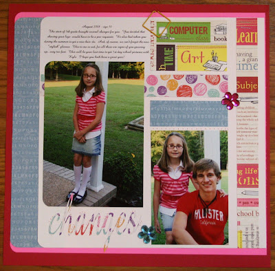
"Changes"
Little Ann's page is designed using the same sketch as Big Dan's. I just chose more feminine "schooly" papers. Both of their titles I cut using the die cutter. Her title is "Changes" and the journaling just talked about..her shaving her legs, getting a new hair style, and getting "growny girl" glasses. All big changes for her. I used a couple of flower bling pieces.
"OOPS! My Bad" - I think this is my favorite. Not because it looks the best, but because it captures some hilarious content. Well....it's hilarious now, but it wasn't then. We bought Big Dan a Honda Civic on April 19 this year and he wrecked on April 21. Yes people..2 days. That's all it took. Now you see why I need tranquilizers until he gets out on his own? It was inevitable, I knew. Which is why I was already pretty much mentally prepared. It wasn't a surprise to me, but I did think it would've been longer than 2 days. He keeps it real. What can I say.
I just used some scraps of the black ribbed scalloped paper. Also some bright card stock to add some color since the car is grey it looked kind of dull. I sewed a zig zag stitch around the patterened paper and used the cutest little brads that looked like screws. The title is chipboard I painted, and I also used some ribbon.
"Mother's Loving Ways" - This one I was very pleased with. I used this picture on my "tribute to my mom" post. I won't go through all the journaling with you, but if you are just tuning in to my blog and are interested go visit the post. She's a great woman and an excellent seamstress with a new ETSY shop!! I got this paper at Mardel's and I loved it when I saw it. I tore the paper and used some rub on with bling for this look.


10 comments:
All I can say is, "Wow, you are SO talented!" I have thought about trying scrapbooking for awhile, but I've always been a bit intimidated by it. You may have just inspired me! Great, great job! Personally, I wouldn't change a single thing about any of the pages.
You do not disappoint!! Everything is so great and creative! I love it.
I say go for it - enter them in the fair, they are very good, i think you would a very good chance at winning.
if i can ever convince myself to get started scrapping, I am coming to you for guideance. maybe we can plan a day & have a little mini class reunion of just us girls & you can give us a scrapbooking workshop.
Absolutely, without a doubt good enough!!!
They are AWESOME. Reminds me of how behind I am on my books. *sigh* I'll get caught up someday!
I love how creative you are! Thank you for sharing these with us!
Cheers!
Jamie
I love your pages. I think you should definitely enter them in
the fair too.
What beautiful pages they are! You are so creative...cute blog!
-Sandy Toes
Your pages look so good. I really need to get into scrapbooking again. I have files saved and disks staring at me in the face just full of pictures I need to crop. I even have the perfect studio to get some work done, but I just can't seem to get into it again. Any suggestions?
You've excelled yourself!!! These pages are wonderful and should definitely be entered at the fair... keep us posted on that one... Now, I feel rather inspired by your pages, particularly the sports one, but not even the toothpicks are holding up my eyelid - I'm typing this with only one eye open!!! So, I'll come back tomorrow, take another peak and get going at my desk after a good night's sleep. It's been a big day celebrating a little guy's third birthday!!! Thanks for the sweet wishes - you're a darling!
LOVE THESE LAYOUTS!!! I found your blog though Leigh Ann who follows yours. I had to sketch the first one to rememebr the layout to try the next time I scrap!
Post a Comment